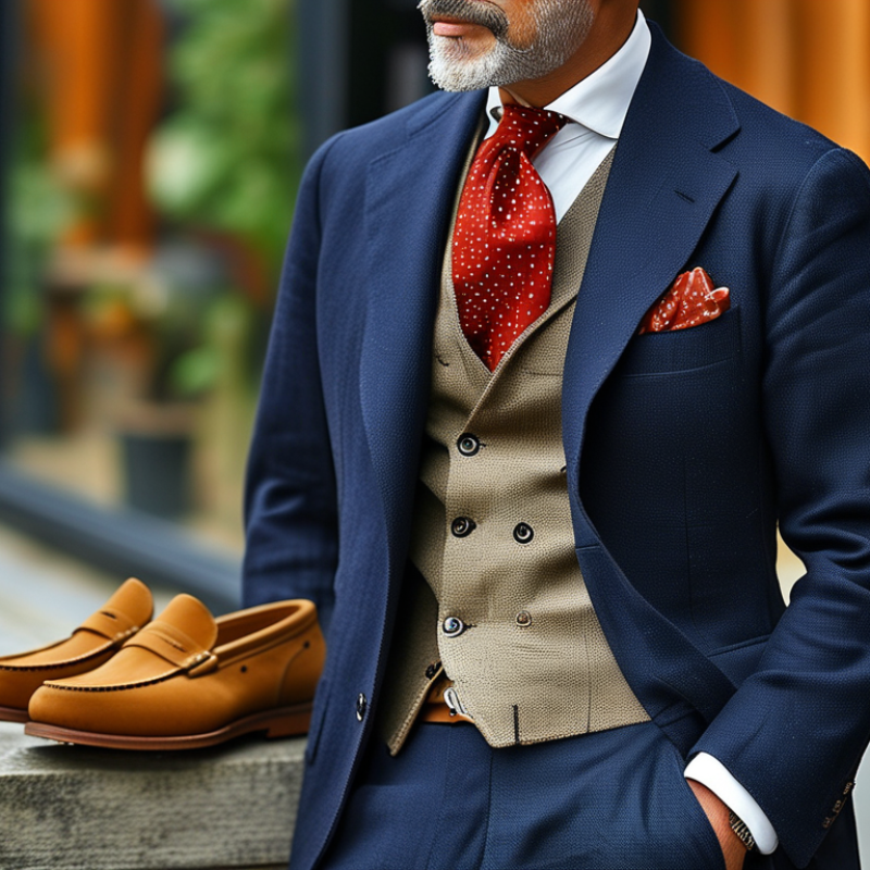
Learning how to combine colors in men’s outfits begins with observation, not expensive labels. A navy blazer, white shirt, and brown loafers show how contrast can remain controlled. The colors feel familiar. They also suit many settings, from a client meeting to a relaxed dinner.
Giorgio Armani, an influential fashion designer, once said, “The difference between style and fashion is quality.” His statement also applies to color. Strong outfits usually depend on restraint, fabric, and fit. They do not need every popular shade. Start with one dominant color, add a supporting neutral, then introduce a smaller accent. Charcoal trousers can anchor an olive overshirt and cream sneakers. A burgundy pocket square may provide the final detail without shouting.
Texture changes color perception. Navy wool appears softer than navy nylon. Cream linen looks brighter under summer sunlight. These differences matter. They are easy to miss in a fitting room.
There is no perfect formula. Personal coloring, workplace expectations, season, and cultural context can change the result. Sometimes a planned combination looks dull. Sometimes an unexpected pairing works better. That is part of developing judgment.
A useful practice is photographing outfits in natural light. Review the balance later. Notice whether one color dominates too heavily. Also check whether the shoes repeat a tone from the shirt, belt, or outer layer. Small links create visual continuity.
This guide will explore practical color relationships, reliable neutral palettes, and common mistakes. It will also question simple rules when real wardrobes refuse to follow them. Dress better, but stay observant.
Color Theory Basics for Men’s Outfit Coordination
How to Combine Colors in Mens Outfits?
Color theory makes men’s outfit coordination more practical, not more complicated. Start with the color wheel: complementary colors sit opposite each other, while analogous colors sit nearby. Navy trousers with a pale blue shirt create a calm, analogous combination. Add a rust-brown belt for controlled contrast. Neutral colors, including gray, beige, white, and black, help stronger shades look intentional.
The 2024 Global Color Trends report from Color Marketing Group draws forecasts from more than 20 markets. It highlights earthy, restorative colors and softer natural tones. This supports a useful wardrobe approach: build around grounded neutrals, then add one expressive color. The 2024 State of Fashion report also describes increasingly value-conscious shoppers. Versatile colors can therefore improve outfit reuse. I still find strict color rules imperfect. Lighting changes everything. A green that looks refined indoors may appear harsh outside.
Tips: Use the 60-30-10 balance. Let one color cover about 60% of the outfit, a second shade cover 30%, and an accent cover 10%. Try charcoal trousers, an ivory shirt, and a muted orange pocket square. Keep the accent small. Two bright colors can compete quickly. Match temperature when unsure: warm beige works naturally with olive, rust, and cream. Cool gray pairs more smoothly with blue, lavender, and icy green. Check the outfit in daylight before leaving.
Assessing Skin Tone, Hair Color, and Personal Style
How to Combine Colors in Mens Outfits?
Assessing skin tone, hair color, and personal style makes color matching more convincing than following seasonal rules. Start with your face. Hold a white shirt, cream shirt, and muted blue fabric near your skin. Notice whether your complexion looks clearer, duller, or slightly red. Warm undertones often suit olive, camel, rust, and softened yellow. Cool undertones can support navy, charcoal, icy blue, and burgundy. Neutral skin can move between both groups, but contrast still matters.
Hair color changes the visual balance.
Dark hair can carry stronger shades, while light hair often benefits from medium-depth colors. Red or golden hair may connect naturally with brown, green, and warm grey. Your outfit should not copy your hair exactly. Use one related color, then add contrast. Keep one anchor. GlobalData’s 2024 apparel consumer research highlights comfort, fit, and price as major purchase influences, so attractive color combinations must remain practical. The McKinsey and Business of Fashion State of Fashion 2024 report also describes cautious, value-focused shoppers. A versatile palette therefore deserves priority over dramatic novelty.
Personal style decides how much contrast feels authentic.
A minimalist dresser may prefer two quiet colors and textured fabric. A creative dresser might add a saturated scarf or unusual trouser shade. I still break this rule when dressing quickly, and the result can look flat. That mistake is useful. Photograph outfits in daylight, record the combinations that work, and question whether the colors suit your face or merely look fashionable on a screen.
Building Outfits with Base, Accent, and Neutral Colors
Building a men's outfit becomes easier when each color has a clear job. Start with a base color for the largest area, such as navy trousers or a charcoal overshirt. This color sets the outfit's mood and should feel easy to repeat. Add neutral pieces in white, cream, gray, or brown to create space between stronger tones. A white shirt under a navy jacket keeps the contrast crisp without looking loud. Keep it quiet. In my experience, choosing the base before shopping prevents random color decisions.
Accent colors should appear in smaller areas, such as socks, a scarf, a knit tie, or a pocket square. Rust, forest green, or muted blue can add personality without controlling the entire outfit. A useful working rule is one base, two neutrals, and one accent. It is not a law, but it gives beginners a reliable starting point. If the accent is bright, soften the other colors and reduce competing patterns. Check the outfit in daylight, because store lighting can hide clashing undertones.
Texture changes color perception too. A matte cotton shirt looks calmer than a glossy synthetic one, even in the same shade. Match warm colors with warm neutrals and cool colors with cool neutrals when the outfit feels unsettled. I sometimes break that rule with tan and blue, but the result can look accidental. That is the useful part: take a mirror photo, remove one piece, and compare. Fit still matters more than perfect color theory. A well-fitted jacket can make a slightly imperfect palette appear intentional.
How to Combine Colors in Men's Outfits
Building outfits with base, accent, and neutral colors
The chart applies the widely used 60–30–10 color-balance rule: use a dominant base color for about 60% of the outfit, a secondary neutral for 30%, and a small accent color for 10%. This creates visual hierarchy while keeping the outfit coordinated.
Matching Colors by Occasion, Season, and Formality
How to Combine Colors in Men’s Outfits?
Occasion should guide your color contrast.
For business formalwear, use navy, charcoal, white, and pale blue. Keep the contrast controlled. A charcoal suit with a white shirt appears precise without looking severe. For interviews, avoid bright accessories and complicated patterns. Your clothes should support attention, not compete for it. I still find black easier to style, but it can look flat under office lighting.
Smart-casual settings allow warmer combinations.
Try olive trousers with an off-white shirt and dark brown shoes. For dinner, rust, burgundy, or deep teal can add personality without losing polish. The Spring/Summer 2025 Fashion Color Trend Report lists ten standout colors and five classic shades, showing how trend palettes balance novelty with practical neutrals. That balance matters. A trendy color may fail when it clashes with your skin tone or existing wardrobe.
Season changes the visual weight of color.
Spring suits soft green, stone, sky blue, and cream. Summer favors lighter fabrics and brighter contrast, such as sand with pale blue. Autumn supports rust, forest green, camel, and chocolate brown. Winter usually benefits from deeper colors and sharper separation. A 2024 apparel consumer report from a major market-intelligence firm found that comfort and versatility remain important purchase factors. Therefore, choose colors that work across several outfits. I sometimes overmatch tones. It looks safe, but not always interesting. A small imperfection, such as a muted red sock or textured cream scarf, can make the outfit feel lived-in.
Avoiding Common Color Errors and Refining the Final Look
How to Combine Colors in Mens Outfits?
Color mistakes often appear in small details. A shirt can look balanced indoors but harsh under afternoon sunlight. I check the outfit near a window before leaving. Natural light reveals clashing undertones, especially between cream, white, grey, and blue. Start with one dominant color, then add one supporting shade. Keep the third color subtle, such as a muted belt, watch strap, or pair of socks. Three strong colors usually compete for attention. That can make a well-fitted outfit feel strangely busy.
Avoid matching every item too precisely. Identical shoes, belt, and bag can look planned rather than natural. Brown leather beside navy often feels softer than black, but the shade still matters. Dark brown with bright navy may create an awkward split. I sometimes choose colors that seemed correct on paper, then notice the outfit looks flat in a mirror. Adding texture can help. A knitted tie, brushed cotton shirt, or lightly patterned pocket square creates depth without adding another loud color. Keep patterns quiet when the trousers already attract attention. One focal point is enough.
Before stepping outside, remove one accessory and take a quick photograph. The camera exposes distractions I miss in the mirror. I still make poor choices occasionally, especially when dressing quickly. That is useful feedback. Clothing should look intentional, not laboratory-perfect. A slightly imperfect combination can feel more personal, provided the colors share similar warmth, depth, or contrast.
How to Combine Colors in Men's Outfits? - Avoiding Common Color Errors and Refining the Final Look
| Outfit Formula |
Main Color |
Supporting Color |
Accent Color |
Color Relationship |
Best Use |
Common Error |
Refinement Tip |
| Navy Suit Base |
Navy |
White or ivory |
Burgundy |
Classic contrast |
Business, weddings, evening events |
Adding too many bright accessories |
Keep burgundy limited to the tie, pocket square, or socks. |
| Charcoal and Blue |
Charcoal |
Light blue |
Brown |
Cool base with warm accent |
Office wear and smart-casual outfits |
Using black accessories that make the outfit look severe |
Choose medium-brown leather to soften the charcoal. |
| Olive Casual Layer |
Olive |
Cream or beige |
Dark brown |
Earth-tone harmony |
Weekend wear, outdoor activities, casual dinners |
Combining olive with several competing earth tones |
Use one dominant earth tone and keep the rest neutral. |
| Tan Trousers Formula |
Tan |
Navy |
White |
Balanced light-dark contrast |
Spring, summer, travel, business-casual settings |
Matching tan trousers with a shirt that is almost the same shade |
Create separation with a clearly darker top layer. |
| Monochromatic Gray |
Medium gray |
Light gray |
Black |
Monochromatic layering |
Minimalist dressing and modern formalwear |
Using identical gray values from head to toe |
Vary shade and texture to prevent a flat appearance. |
| Brown and Blue Casual |
Brown |
Denim blue |
Sand |
Warm and cool balance |
Relaxed weekends and casual social events |
Pairing multiple shades of blue without a neutral break |
Add a cream, white, or sand-colored item between strong colors. |
| Black and White Base |
Black |
White |
Muted red |
High contrast with a focused accent |
Evening events and contemporary casualwear |
Using a saturated accent on several large garments |
Restrict the accent to one small or medium-sized item. |
| Burgundy Smart-Casual |
Burgundy |
Heather gray |
Navy |
Deep-color harmony |
Autumn and winter social occasions |
Combining burgundy, navy, and black with no lighter element |
Use gray, ivory, or light blue to add visual breathing room. |
| Three-Color Rule |
Navy |
Beige |
Brown |
One dominant, one supporting, one accent |
A reliable starting point for most outfits |
Treating every color as equally prominent |
Let the dominant color cover the largest area; keep the accent controlled. |
Practical guideline: A polished men's outfit usually works best with one dominant color, one supporting neutral, and one restrained accent. Also consider contrast, season, formality, fabric texture, and the visual size of each colored item.
Conclusion
Learning how to combine colors in men’s outfits begins with understanding basic color relationships, including complementary, analogous, and neutral combinations. Personal features also matter: skin tone, hair color, and individual style can guide the choice of shades that look balanced and natural. A practical outfit usually starts with a dependable base color, adds one or two accent colors, and uses neutral tones to create harmony without looking overwhelming.
When considering how to combine colors in men’s outfits, the occasion, season, and level of formality should influence every choice. Softer and lighter shades often suit warm-weather or relaxed settings, while deeper tones can create a polished appearance for cooler seasons and formal events. Avoiding too many competing colors, excessive contrast, or mismatched undertones helps maintain a refined look. Before finalizing an outfit, check that the colors work well together in different lighting and that the overall result reflects both the setting and your personal style.

 CLStyle Fashion